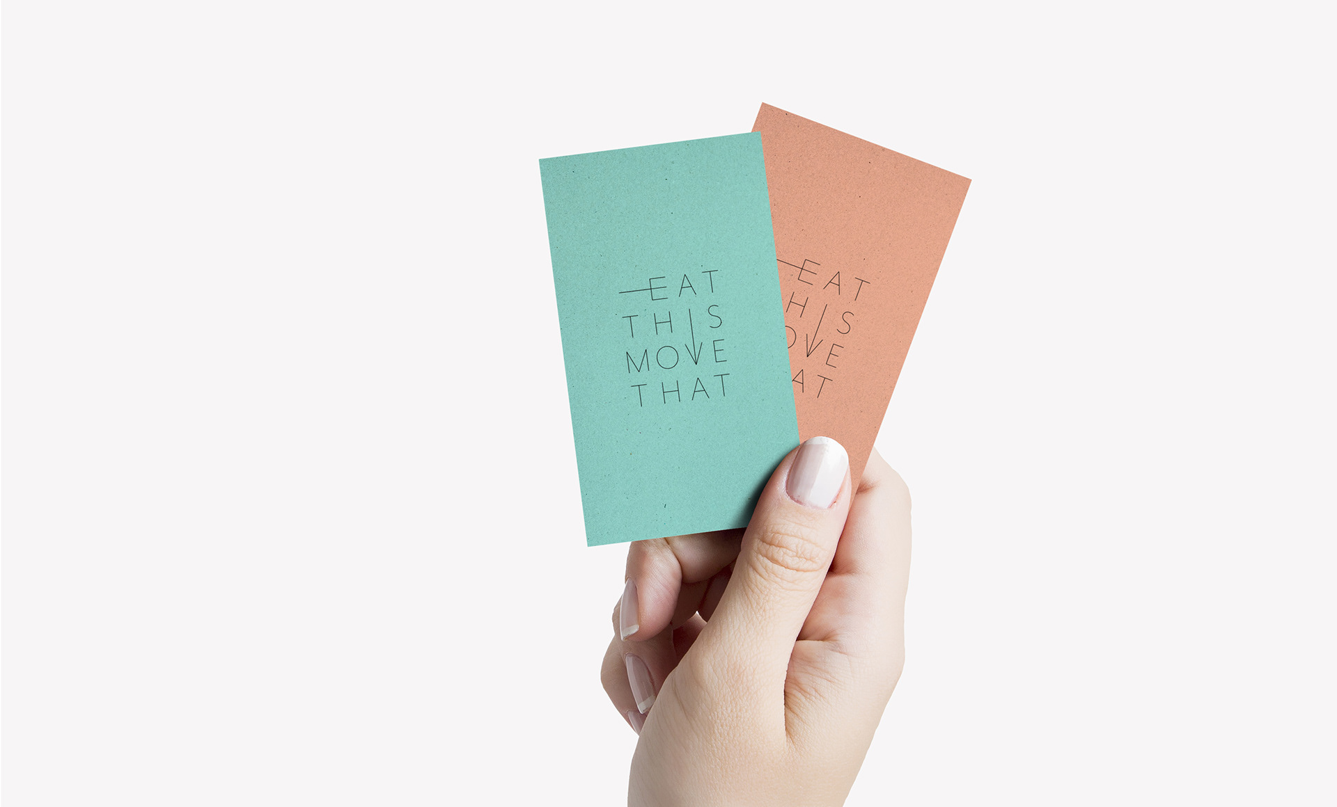

CLIENT: Eat This Move That is a health and wellness company, located in Vancouver, BC, Canada. They offer workshops for private and corporate groups on movement and meal planning, as well as one-on-one sessions in exercise therapy and meal coaching.
PROJECT: Brand Identity
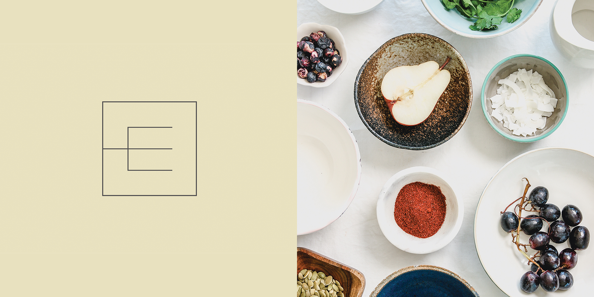
For the typographic logo, we used subtle extrusions of the letterforms to visually reinforce the concept of movement and nourishment. If you look closely at the logotype you will notice the 'E' resembles a fork, and the 'V' is a directional arrow.